Saturday, April 18, 2020

'Chive Cast 106 - Assy Nikto Deep Dive


Skye and Steve begin their 11th season by taking a deep dive into the Sarlacc’s pit to discuss Nikto in more detail than you thought imaginable. Movie thoughts, hardcopies, fake hardcopies, mock-ups, Hungarian calendars, surprisingly cool foreign variants, POTF MarketWatch and a completely optional poetry slam. Let the 77 backs begin with Boba Fett’s lamest wingman.


Loading the player...

DIRECT LINK DOWNLOAD
ENHANCED YOUTUBE VERSION


Image Sources and Show Note Links:

Thursday, April 16, 2020

The Action Figure Grading Phenomenon: Part II - The What, Who, Why and How

Pete writes:

 Coming back into the discussion that we launched over a year ago, I bring you the second in our trilogy of articles on the action figure grading phenomenon. Last time I talked in length about the history of grading as it related to a wide spectrum of collectibles. Here we established a baseline for the overall conversation on grading. If you missed that be sure to take a quick read through of how the grading practice originated in other hobbies and ultimately made its way into our hobby.  
                                                              

With this installment we cover the bigger picture of what grading offers collectors and its place in the hobby today. In short, this is the what, who, why and how of action figure grading.     

The What (i.e. What is Grading?)

Not getting overly complicated, grading in its simplest form is the evaluation of an item's condition and the assignment of a numeric score based on a third party inspector’s (grader’s) assessment. The items are then encapsulated in a container that is sealed to preserve, protect and display the item itself.

At the center of this we have the score (grade) that is assigned to the item. Simply put, whether via a 1-10 or 10-100 scale, it’s about placing the condition of the item on a numeric spectrum for comparative purposes. The score unfortunately draws a disproportional amount of attention from many collectors, as many ultimately oversimplify the grading practice as a whole, making it about this number and the assignment of it. Those shortsighted individuals are missing the bigger picture -- that being that the score itself is not the be-all-end-all reason why this practice has become so popular. We’ll discuss this more later in the article.

Truly the score is about removing subjectivity and biases. Some of you have been collecting long enough to remember the days where you didn’t get pictures of items before you bought them. For those in that group, I bet you are more than likely to have at least one or two stories about receiving an item and feeling like it differed greatly from how it was described. With those that have been collecting over the last twenty years, similar issues come up on eBay and other sites. Poor pictures, lack of descriptions and just generally lackluster information on an item lead to a gap between perception and reality.


Even the usage of collector-made scales like the C-Scale, which is used to help clarify condition and value, has its own flaws on this front, mainly because one person’s evaluation could be based on completely different conditional attributes than another. There are other factors that come in as well, such as experience and literal objective biases. But at the end of the day the biggest flaw in the scale comes from its universal subjectivity and lack of specificity in how a score is being assigned.       

Given its scoring system, grading has become increasingly popular in the hobby, especially on platforms like eBay. Some customer types in this venue include those with a “burn” effect -- collectors who have had issues with condition of items from online auctions and websites. This effect along with the general mistrust of others that people seem to have online has played very well for the practice as the subjectivity is lessened through the third party representation.  

The standardization of evaluations has become one the most prevalent benefits when it comes to the practice of grading. Most companies carry examples on hand of the same items that you are getting graded, thus they have a basis for comparison from mint down to poor condition. This is important in many ways to establish what a figure should look like in pristine condition, especially given the drastic differences you see in color variance and depth within certain toy lines. At the core this has reduced the “he said – she said” situation that we run into.

The Who of Grading

Another aspect of grading is the graders themselves. Who are these people, where do they come from, and what makes them an expert in toys? These are some of the most common questions that are brought up with it comes to another factor around the great grading phenomenon: the WHO. No, not the British rock band from the 60s, but more who are the people that are grading these items.  

Some of the backgrounds of these graders include artists, critics, auction house evaluators, architects, and other job fields where aesthetics and preservation are critical. The long and short is that these companies employ individuals who are creative and detail-orientated -- the two factors that I think are most important when casing items. Whether it’s Leigh and Ken at CAS or Chad and his team at AFA, each brings a unique perspective to their evaluation and casing style.

We'll dive more into the Who with our next article as we take a deeper look at each company, but I wanted to mention the people behind the scenes here, as they are a critical component of what makes grading a popular practice today. 

Why would a collector be inclined to do this? 

So why would someone grade their collectibles? This must be the most common question among those who are new to the practice of grading, and ultimately, it’s probably the most important among established and new collectors. The elusive why.

There is no universal response to this question as ultimately there are several reasons why. Depending on the audience, this is asked with resilience or sometimes tongue-in-cheek, as many collectors already have preconceived notions about the practice.

To quote the AFA website, “Authentication, Preservation, and Evaluation” are the main reasons people grade their collectibles. 

We’ve touched on evaluation already so let’s look at the other individual components:

Authentication: In simple terms authentication is ensuring it’s an original, legitimate item and not a fake or reproduction, and whether it's altered in some way. When it comes to grading, authentication can be a bit of a misnomer (explaining ink touch-ups, reseals), as certain items are not truly authenticated but rather they’re reviewed to ensure lack of tampering and compared with known examples. This is most common with production items, i.e. what made it to store shelves.  

Additional authentication may take place for pre-production or more commonly faked items like double-telescoping lightsaber figures and vinyl cape Jawas. At AFA it’s called the Grading and Authentication service and is paired with a review by Collectible Investment Brokerage (CIB) -- one of the foremost authenticators in the hobby.  


When it comes to pre-production items, this service involves additional steps through experts in the field to verify the origins, purpose and variation from the production counterparts. Sometimes this is obvious with different molds or paint jobs, but it involves more detail review using advanced tools to ensure that you’re production items weren’t stripped, sanded or altered to make them appear different in a way that could be construed as pre-production. This is typical and an additional service where in turn collectors are presented with a COA (Certificate of Authenticity) with additional details on the item.

As important as authentication is to grading, it’s not the driving force behind why most collectors grade their collections. That title goes to Preservation.

Preservation: Whether it’s protecting the item from natural elements or protecting it from your kids or pets, encapsulation (casing) of items always ranks up there as a top reason as to why grading has become so popular over the years. Encasing items in acrylic doesn’t make them bullet proof, but it could be the next best thing besides locking items in a bank vault. In similar fashion to how a museum may protect something that’s precious or valuable, acrylic encasement gives the item an added level of protection and improves the aesthetic of many items. This can be seen across almost any vintage item, but is extremely important for items containing cardboard, weak plastic bubbles, and tape or glue-sealed items. Different methods have been employed by multiple companies to address these issues and help items stay in their original unaltered condition for as long as possible.  


There have been a few innovations over the years to really help with some of the more common problems via case design. The most commonly seen of these innovations would be the bubble protector. These four-sided walled structures were introduced for lines that have significant issues with the plastic figure bubbles remaining adhered to the packaging. These bubble protectors keep the bubble and card more securely held together to help stave off separation as these pieces age. The structure of cases has morphed as well. Simple changes such as using dowels vs. square inner bracing or the advent of using shoulder pads and handcuff style inner bracing have lead to the cases themselves doing a better job protecting the items over the years. 


With advancements in the casing of mailers and multi-packs along with the aesthetic progression that we’ve seen with CAS and AFA on the loose action figure front, grading has conversely brought about new possibilities from a display perspective into multiple segments of the hobby. In the case of loose action figures, grading has really invigorated a segment of collecting that was being overlooked by many “higher end” collectors and hobbyists.

Not only have case styles evolved to address the aforementioned issues, the materials used in these cases has evolved over the years as well. Museum or archival quality acrylic has helped maintain the lifetime of these items by offering additional solutions for light sensitive items. This is mainly seen in additional UV protection that different types of acrylic can offer. UV light, which can be a major concern for people displaying their collection, is thus partially or fully blocked through unique blends of acrylic and the utilization of UV resistant film. This helps the items maintain the depth of color and also helps in protecting some plastics from turning yellow due to UV exposure.

Much like case designs, the scoring of a piece has taken on changes over the years to accommodate growing segments in the hobby. Moving from single to three tiered scoring along with the addition of Y grades to designate yellowing plastic were good moves and helped with the accuracy of scoring. In this situation I’m referring to more sweeping changes that impacted the scope of what could be graded, specifically the Ps ad Qs.

The Q-Grading Scale was introduced by AFA in the early 2010s and expanded upon a major segment that grading companies had stayed away from historically: new in box toys that were no longer sealed. The Q in Q-Grading stands for Qualified. It was a simple augmentation on the current grading scale, allowing collectors to quickly identify that the item has been open by adding the letter Q to the grade and also changing the background of the label from red, which is seen on sealed items, to blue. Items do need to be new and unused in order to qualify for this scale. As such, it wasn’t an open invitation for all MIB items to come in. Instead this was about helping a conditional fringe in the hobby, as double taped, questionable taping, and items that were new but not sealed now qualified for grading. It was a big win for the hobby, as these items should be documented and preserved in a similar light to their sealed counterparts.

CAS has taken this even a step further in their fight to maintain the integrity of items that have been severely damaged from a preservation perspective. The P-Scale (Preservation Scale) is used on cut card figures to ensure they aren’t removed from their bubbles and preserved. Given the lack of new inventory to hit the market in the past 20+ years, this has become a more protected segment for collectors over time, and as such the service meets a growing need for preservation. New concepts like the P-Scale are important as grading needs to evolve like the hobby. Where there is new demand, we need new concepts. 

Remember when I told you not to get stuck on the numbers? It wasn’t that far back and there’s a reason. Many are unaware still to this day that there really are two main services offered by these companies when it comes to sealing items in acrylic: grading and encapsulation. These two activities are not one in the same. The latter is a less expensive way to preserve the items and gain the aesthetic and preservation elements that are associated with grading. Thus if you truly don’t care about the number you can save yourself some money and maybe a little stress by going this route vs. traditional grading. 

How (How’s it done)?

Now that you’re excited about this (or extremely annoyed) and armed with the background, just how in the heck does this work? Well, the “how” varies for each company to some extent, but we’ll cover the broad strokes and try to address a few of the specifics of each company.  

First the specifics. Each company has their own process for submitting items to be graded and I’ve linked to the different processes below for reference:


Given both the length of this article and the particulars of each company, I won’t drone on about this in detail, as both companies do a great job summarizing what you need to do and where you need to send your items.

In short, the broad strokes of the process involved the following steps:

  • Paperwork – either online or handwritten.
  • Packing – protecting the items so they make it there unscathed.
  • Payment – show us your money!
  • Grading – the evaluation and casing.
  • Return Shipments – getting your items back.

Turnaround times and prices vary by company, so be sure to familiarize yourself with the specifics of each organization via their website.

Summarizing a few tips from a seasoned collector:

  1. Ensure you’re familiar with the price structure, specifically bulk or member discounts.
  2. Pack your items appropriately. The websites will make mention and give suggestions, but take extra care as there’s nothing worse than something happening on the way to the graders.
  3. Be familiar with turnaround times prior to submitting. Make sure you’re okay with not seeing your items for 3-4 months in a lot of cases. Take things like pending trades and your own sanity into account.                                                                 
If you don’t have much background on the companies or want more details on them, sit tight as our third installment in this digital trilogy will be released in the coming months which will cover the companies, their backgrounds, the evolution of their services, and which services they offer.

Concluding this article, let’s summarize:

  • There are many reasons for grading beyond the numerical value itself.
  • It’s a widely accepted practice.
  • Opinions are opinions, make up your own mind and don’t let any tell you any different.  
  • It is a good thing for the hobby. Times change and sometimes people can’t accept that.

Be sure to stop back to the Star Wars Collectors Archive for more articles, our podcast and other new features to help stave away the social distancing period.

Until then... Wampa, Wampa!
Pete

Wednesday, April 8, 2020

Stay Inside the Lines: Kenner's Star Wars Coloring Books (1978-1985)

Ron writes:

 When I was a kid "stay inside the lines" was something you heard regularly -- pretty much every time coloring books became a topic of conversation. Now it's just "stay inside." Both pronouncements imply the threat of social shame, but unless your babysitter was a real as%hole, there was no threat of death attached to coloring.

Anyway, back in the '70s and '80s there were Star Wars coloring books. That was a long time ago, back when you could go stores and visit friends. So while I sit here in my home, alone, feeling a little hazy, and wondering if there's really any point in going back to a the kind of lifestyle in which pants are necessary, I figured I might as well put together a post focused on those papery-smelling relics of days gone by. It's better than thinking about the future.

1978

The first Star Wars coloring books were released in Canada. There were four different books, presumably issued in 1978.

Oh, I guess I should mention here that I'm only going to be reviewing coloring books released by Kenner in Canada and the United States.


This qualification occurs to me now, as I contemplate the above coloring book, because it's clearly a very Kenner sort of thing: The "double racetrack" border, the black-and-silver color scheme, even the lozenge nameplate, indisputably brand this as a Kenner product of the 1970s.

As a toy collector I'm probably biased, but to me that's just what Star Wars looks like.


Whoever at Kenner Canada was responsible for putting together these products must have hated Han Solo, because both the aforementioned book and the one you see directly above feature publicity stills that have been cropped to highlight Chewbacca to the detriment of Han.

You can tell by the expression on Luke's face that he's not convinced of the wisdom of this decision.


This book shows Luke fiddling with C-3PO's arm.


This R2-D2 book rounds out the set of four. It shows R2-D2 after the Tusken Raiders attack him, C-3PO, and Luke. Or at least I think that's the scene. If I'm wrong, please don't write to me with a correction; just keep it to yourself, like your damn germs.

The interiors of the Canadian books featured drawings that can only be called crude.


Okay, they can also be called grossly inaccurate. I believe that's supposed to be a TIE Fighter pilot.

A source of mine claims that Kenner Canada relied on a team of college art students to create these drawings, giving them a mere week to produce content sufficient for four coloring books. The students were supplied with a meager cache of reference material and told to supplement it with whatever they could find on comics, trading cards, and advertising material.


That's probably why this particular image looks copied from issue number four of Marvel's comic series.


Also, as I pointed out way back in the '90s, several images in the Canadian books were based on prototypes of Kenner toys. This Death Star Droid is a good example: it's obviously based on the concept model for that figure, a photo of which appeared in some promotional materials.

I wouldn't be surprised to learn that Kenner Canada provided the aforementioned art students with a similar photo to use as reference.


This is one of the few (perhaps the only?) representations of Blue Snaggletooth to turn up in association with a non-action figure product. And, no, I'm not counting the one seen on Bespin on some random notepad. That's just a Snaggletooth wearing blue and not Blue Snaggletooth. Gimme a break with that nonsense.

Blue Snaggletooth has boots. If you don't see a boot, your point is moot.


Canada being a weird country with two official languages in addition to about a million Tim Hortons, the books feature English on their front covers and French on their back covers. The above photo shows the backs of all four books.

1980

1980 Saw the release of The Empire Strikes Back and a large assortment of related merchandise.

Weirdly, despite the example set by Kenner Canada, the U.S. division of the company neglected coloring books until the early 1980s.

As far as I know, though Kenner had marketed plenty of paint sets and produced some three-dimensional coloring items, they'd never done coloring books. Perhaps their inexperience in that arena explains the delay.


However, by the time 1980 rolled around Kenner's catalog was promoting a range of four coloring books. Based on the photo in the lower right corner, these were the books released in Canada, but rebranded with the Empire logo.

Why didn't it happen? My guess is that someone at Kenner took a look at the Canadian product and realized it was pretty shoddy. Or perhaps Lucasfilm objected, as they supposedly did in the case of the notorious utility belts, also released by Kenner Canada. In any event, I think it's reasonable to assume that someone in a position of authority determined that better coloring books were needed.

1981


Sure enough, when Kenner's 1981 catalog rolled off the presses, it showed a higher quality of coloring book.

I think these were released in late 1980, but I'm considering them 1981 products, as that's when they debuted in the catalog. In all likelihood, retailers who ordered coloring books in 1980 received these and not the rebranded Canadian ones featured in the 1980 catalog. Note that the product number of the books from the 1981 catalog is identical to that associated with the books in the 1980 catalog.

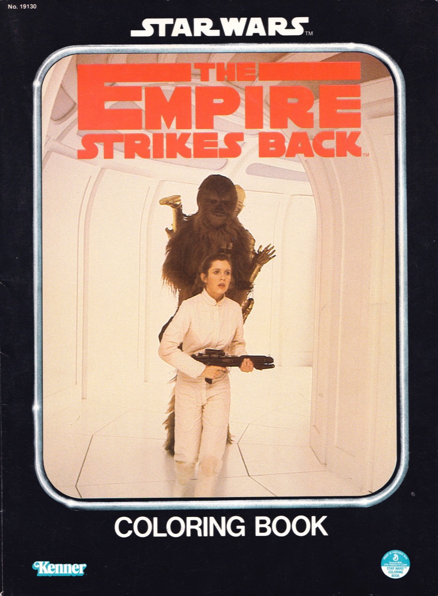
Four books were released in this wave. Here's the one showing Leia and Chewbacca on Bespin.


I call this one "we'd be honored if you would join us."


Luke opening a door on Bespin.


Rounding out the set is this book showing R2-D2 escaping from the Rebel base on Hoth.


In Canada, the same four books were issued, though they featured French text on their back covers. If you look closely, you'll also notice an alternate stock number in the upper left corners. Their front covers are identical to those of the U.S. books.


You know this was a class operation because each book features a unique frontispiece trumpeting the names of the folks who created it. It's interesting to note that they were edited and art-directed by Lucasfilm rather than Kenner.

It's also interesting to note that they were all printed in Canada.

Though the art inside these books is a step up from the crude scribblings of the Star Wars-branded books released in Canada, they contain some pretty weird content. 


The above image is a good example. What am I supposed to be looking at?

Is that Doctor Mindbender? And did he just say something rude to Darth Vader?


I love this Godardian distillation of the Male Gaze.

1982


In 1982, Kenner's line of coloring books did not increase in number (there were still four different books), though two new books were added. That means that two were jettisoned from the line. I don't know which two.


One of the new entries was this Yoda book.

He looks like he just finished seeing a vision of a future filled with COVID-19 and Baby Yoda memes.


The other new book was this altogether metal-looking example showing Darth Vader and two Stormtroopers.

Is it me, or does this particular book seem almost like something from the '70s? It has the hard-edged "pop" look of Kenner's '70s line.


The interior images of the new books feature blue rather than black lines. This one depicts one of the props used to create the Wampa.


The 1982 books were also released in Canada. This time they featured French text on the front and back cover, though the French-language ESB logo appeared on the back only.

1983


In 1983, a year that saw the release of Return of the Jedi, Kenner shrank their line of coloring books from four to two books.


One book features an iconic shot of Luke aboard the Sail Barge.


The other shows Max Rebo.


Naturally, these books were entirely new and devoted to imagery drawn from Jedi. Like the 1981 books they feature a frontispiece naming the illustrator: in this case Susan Nelson.

Nelson was pretty talented. Without a doubt, these are the highest quality coloring books released by Kenner in association with the Star Wars license.


I particularly love the above two-page spread, with its tapestry-like density of detail.

By the way, from an iconographic standpoint, are the Rebel Commandos the most gay-adjacent characters in the Star Wars universe?


This guy in particular seems to be on loan from the Village People or the portfolio of Tom of Finland.

The Rebel Commandos: they commando hard, and they play hard.

The ink used in these was again somewhat bluish in color.


Both of these books were issued in Canada. The Canadian versions exhibit French text and logos on their back covers.


Before we move on to 1984 I'd like to point out an interesting detail that was mentioned to me by Todd Chamberlain. Both the 1983 and 1984 Kenner Repro Art Books (Kenner-issued repositories of black-and-white imagery intended to be used in print advertising) show a coloring book featuring on its cover Princess Leia, C-3PO, and Chewbacca; the setting is Endor.

It seems that, at one point prior to production, this Endor book was nixed in favor of the one featuring Luke. Possibly someone came to his or her senses and determined that Luke brandishing a lightsaber was more exciting than Leia touching C-3PO's face. Whatever happened, Kenner didn't bother to change its clip art. Above you see the coloring books as they appear in the 1984 Repro Art Book.

1984

That Repro Art provides a bridge to our next topic: the coloring books released by Kenner in 1984.


As you will learn by reading the text of the above page from Kenner's catalog of that year, 1984 saw the line expand to three books, the two previously discussed and a new one featuring a shot of Lando Calrissian


There he is atop of one of Jabba's skiffs, showing an alien who's boss the administrator of Cloud City.

This 1984 book does not feature a frontispiece and seems to have been created by an artist who was not Susan Nelson. The art is a little less sophisticated than that featured in the earlier ROTJ books, though it's still pretty nice.


This majestic Lando is particularly worthy of admiration.

As far as I know, this book was not issued in Canada.


Also issued in 1984 (or late 1983) were two coloring books focused on Kenner's then new Wicket the Ewok brand, a line aimed at younger children and featuring cartoon styling.

As the catalogs note, both these and the ROTJ books shipped in a display that allowed retailers to quickly and easily merchandise them (more on that later).


Each of the Wicket books features unique branding. This one focuses on Wicket and highlights the key branding image of the Wicket the Ewok line: Wicket swinging on a vine and looking irritatingly happy.


The other book features a pretty nice painting that covers the entire front and back covers.


Both Wicket the Ewok books were issued in Canada in bilingual editions.


You can get a sense of the look of the art contained in these books by examining this image of Logray tripping balls.

As might be able to to tell, this art features brown rather than blue or black lines. I guess brown is more Ewokesque? 

1985

By 1985 Star Wars was about done. That year, Return of the Jedi was re-released to theaters, and Ewoks: The Battle for Endor aired on television; but those blips aside, the Droids and Ewoks animated series were basically carrying the torch for Star Wars.


Which brings me to this coloring book, released in conjunction with Ewoks, a show that only the hardest of hardcore Star Wars fans pretends to tolerate.

I think it's the rarest of the set; certainly, it's the one I struggled to find. So if you see one, nab it!

Like the Wicket books from the previous year, the interior images feature brownish lines. But now they're focused on characters familiar from the animated series.


My favorite image is the one featured above, in which Latara and Kneesaa are shown very calmly -- almost beatifically -- using bugs to torture their neighbors the Duloks.

I mean, I know the Ewoks are savages who sometimes eat people, but that is some downright barbaric sh%t.

Store Displays

I teased store displays earlier in this (already too lengthy) piece, so I guess I better get those out of the way before you try to gnaw your own leg off to get away from this article.

Who am I kidding? You are shut in your house and probably drunk. You should be grateful that I'm going out of my way to bore you like this.


The Return of the Jedi books of 1983 and 1984 shipped in this rudimentary counter display -- a nice bonus for retailers who ordered the line. The assortment contained 48 books.


A very similar display shipped with the Wicket the Ewok books. This item is pretty rare, and the blue-red color scheme really makes it stand out. Thanks to Jarrod Clark for providing the photo.

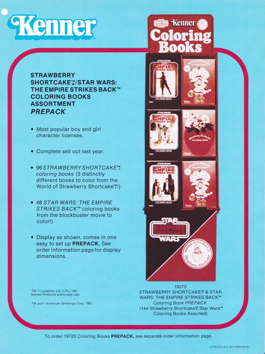
At least two other displays were issued in association with Kenner's coloring books. Both were "prepack" displays. In other words, they were part of a Kenner program to market to retailers a large quantity of product in an easy-to-assemble display.


This ESB-era prepack display combined Star Wars with Strawberry Shortcake; thus it appealed to boys and girls alike.

Yeah, I'm gender stereotyping. Edgy, right? I'm like Poe Dameron in The Last Jedi, mansplaning left and right and just not giving AF. Stop me before I make a joke about Rose Tico.

I'm not aware of an extant example of this display. Store photographs of the era reveal that a unit of this type was released to stores, but that it featured a slightly different design.


Here's another prepack display, this one from 1983. It's unknown whether something exactly like this was released to the public.


The ROTJ prepack display that is known looks like this. Note the similarity of the red areas on this display and the display in the previous catalog shot. Thanks to Todd Chamberlain for providing the image.


Are you tired of coloring books?

I am.

Other things I'm tired of: Zoom meetings, people saying "the new normal," the sweatpants I've been wearing for the last week, and that bitch Carole Baskin.

Tired or not tired, if you decide you actually want to collect these things, you can use the above matrix to aid you in your efforts to complete your set.

Stay home! Wash your hands! Do social distancing! Free Winona! All that stuff!

I'd like to extend a huge thank you to Clint Garniss for his help in assembling images of Canadian coloring books.