
 Ron writes:
One of my favorite pieces of Kenner art was discovered by legendary Cincinnati-area collector Steve Denny. It's a large, action-packed piece showing a battle between the Rebels and Imperials on the forest moon of Endor. As mentioned by Steve in an interview conducted by Kenner Collector, the piece originated with the individual from whom Steve acquired his enormous trove of proof cards -- the trove that is the source of the majority of proof cards that exist today.

Years ago I speculated, in this SWCA database entry, that the art represents an unused alternate or second side of the large store display header, issued in 1984, depicting the space battle surrounding the second Death Star.
Since I recently got the opportunity to examine the art up close, I thought it would be fun to put this theory to the test by comparing it side-by-side with the store display.

You may have already noticed the similarity in the look and placement of the ROTJ logos. Here they are together, the art on top and the display on the bottom. The former is a piece of printed paper that was affixed to the painting; over time, the adhesive used to set it in place has bled through the surface, causing some discoloration. But even so I think it's pretty obvious that they are very similar, right down to the "reflections" present in the "racetracks" delineating their perimeters.
These faux reflections are, as far as I an tell, fairly unique; they don't exactly match those present in the logos featured on production carded figures.
What does that prove? Well, not a whole lot, but it's fairly interesting. I think it's hard to deny that the logos used on these items derive from the same source graphic.

Stylistically, the two pieces are fairly similar. The artist seems to have favored a rather dry paint application, with tight details layered on top of careful underpainting. And, of course, he's taken care to depict the Kenner toys.
In fact, it's very clear that the vehicles and implements depicted in both works are based on Kenner products rather than on the props used in the films. On the display, that is obviously the Kenner Millennium Falcon, not an ILM effects model. Similarly, it's hard to mistake the Scout Walker featured on the artwork for anything but the Kenner toy; it even features those rails attached to the back of the "legs," which facilitated the toy's action feature.
From the evidence of the toys included on the artwork we can reasonably date it to 1983 or early 1984.
The Scout Walker, Speeder Bike, Ewok Village, Ewok Assault Catapult, and Ewok Combat Glider all debuted in 1983. And, with one exception, the ROTJ characters depicted on the piece were released as action figures in 1983: Luke as a Jedi Knight, the Biker Scout, and the Rebel Commando.

The exception concerns the Ewoks. If I'm not mistaken, that's Teebo visible in the above detail. Teebo was released in 1984. The only other Ewok that suggests an action figure is the one standing behind C-3PO. I believe that's Chief Chirpa, released as an action figure in 1983.
The mix of 1984 and pre-1984 products recalls that featured on the store display. The display shows the Y-Wing, Kenner's big vehicle release of 1983, alongside pre-existing products like the Falcon and two from 1984: the B-Wing Fighter and TIE Interceptor. That makes a lot of sense, as the display was released in 1984.
You're probably asking yourself, "Well, Princess Leia in Combat Poncho and Han Solo in Trench Coat were released in 1984, and they're explicitly Endor-related figures. Why aren't they featured on the artwork, Mr. Smartypants?" It's hard to say with any certainty. Maybe Han and Leia are making out behind a tree somewhere? Or perhaps the designs of those figures weren't finalized at the time the piece was created?
Regardless, I feel confident in identifying that one Ewok as Teebo, and Teebo debuted in 1984.
Obviously, Luke is wearing his black Jedi outfit because the Battle Poncho figure wasn't released until 1985, and probably wasn't even on the drawing board at the time the painting was made.


The painting displays greater resolution and texture, because, well, it's a painting and not a printed copy of a painting. But I think it's pretty obvious that the explosion elements were created using a similar technique of painting.

Okay, how do the two items compare in terms of size?
Above you see both items. Obviously, the art is larger. Still, both pieces exhibit a similar length-to-height ratio.

Here is the display laid on top of the art. Again, I think you can see that, although the art is larger, the two pieces have strikingly similar formats.
Now, there's no requirement that art used to generate a store display be exactly the size of the intended display. Often, Kenner artists worked in an exaggerated size, and their pieces were scaled down for production. For proof of this, see the piece discussed here.
Still, it's a little annoying that the art and display aren't exactly the same size. If they were, I'd be pretty convinced that the two items are related.
Alas, the graphical area of the art measures 50 inches by 26 inches, whereas the display is 45 inches by 24 inches. A considerable difference.
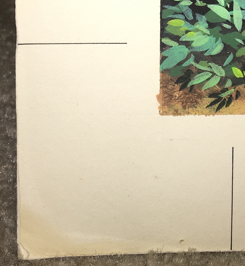
Wait a second, though. If you haven't noticed, the board supporting the art features lines drawn at each corner. Presumably, these define the areas of the piece that would eventually be reproduced. In other words, everything outside of those lines was in the bleed area, meaning those areas shouldn't be factored into our measurements.
Measuring the portions of the art within those lines, we get 48 inches by 24 inches.
Still a bit off of 45 by 24. Rats.
Something about this didn't sit right with me.
Frankly, I was a little surprised to discover that the store display was a measly 45 inches long. I'd always considered it a four-footer.

When I took a look at Kenner's 1984 Pre-Toy Fair Catalog, I realized why: Kenner advertised it as being four feet in length, providing an overall size of 48 inches by 28 inches.
So the length as originally advertised was the same as the length of the usable area of the art.
Interesting.
But what about that advertised height of 28 inches?
Honestly, I don't know. At first I thought the 28 inches included the mounting tabs attached to the display's bottom. But when those are included, the height of the display exceeds 28 inches.
Also, the dimensions given in the catalog for the ROTJ foil display header don't appear to factor in the mounting tab. Why would the dimensions of the "four-foot" header include the tabs when the dimensions of the foil header don't?
I'm stumped.
The bottom line is that the dimensions given in the catalog are wrong where the "four-foot" display is concerned. It's not 48 by 28, it's 45 by 24.

Why did Kenner advertise the display as being larger than it actually is? Certainly, it's possible that the display was scaled down for some reason. But if that is what happened, the scaling wasn't proportional.
If it was scaled down from the dimensions listed in the catalog, 48 by 28, three inches were subtracted from the length, and four were subtracted from the height.
If it was scaled down from the dimensions of the usable area of the art, 48 by 24, three inches were subtracted from the length, and none were subtracted from the height.
To get our art down to 45 inches in length, while retaining the 24-inch height, it would have to be cropped on the left and right side at points inside the bleed lines inscribed in its border.
According to Steve, the art was utilized at Toy Fair; that's what he was told by the person from whom it was acquired. Unfortunately, no photos from Toy Fair have surfaced that show the artwork in the New York showroom. But that doesn't mean it wasn't used in that capacity. If anyone finds a photo of it in use at Toy Fair, please let me know.
Eventual usage aside, was it originally created with a store display in mind?
We may never know for sure, but, as I've tried to express in this post, I think there's at least some evidence to suggest just that. I even think it's possible that the "four-foot" ROTJ header was originally intended to feature unique art on each of its sides. An earlier Empire Strikes Back display boasted a two-image format; even the "Collect All 79" display, released in the same year as the ROTJ header, featured two unique sides.
But I'm not totally convinced, as not all the measurements add up.
What do you think?
No comments:
Post a Comment